UX Design


USAlliance

At USAlliance our main challenge was to make each page as quick and easy to understand as possible. My argument for this direction was that, as a local bank, when the user is searching for information on our webpage, it is probably part of a task on their to-do list that they are not looking forward to. Put yourself in their shoes. You're having another busy day and realize you've lost your USAlliance debit card, or you've forgotten to deposit that check from last week. When you type USAlliance into your phone and navigate to the contact page or branch location page, finding the phone number or address you need should be as seamless as possible. I presented a few different options to this client that accomplish this task.

Fusionww.com

I created the initial wireframes and mockups for the new fusionww.com to accompany the rebrand of Fusion Worldwide. The request was to bring a sleeker new look to a brand that had been well established in the industry for many years. We also were beginning to add a navy blue into the brand so I created this gradient with that blue and the established brand green and meshed that with photos I felt were just abstract enough to keep the eye interested. This photo treatment was very well received by stakeholders so it eventually became an integral part of the brand.

UX mock up of Fusion Worldwide Homepage
UX mock up of Fusion Worldwide News Page
UX mock up of Fusion Worldwide Products Page
UX Mock up of Fusion Worldwide About Us Page
UX Mock up of Fusion Worldwide New Page Pop up Window

FreightPOP Blog

FreightPOP is a client that produces logistics and supply chain management software and they were interested in adding a blog to their website. I did this mock-up for the new blog page and article page.

UX Mock up FreightPOP Blog
UX Mock up FreightPOP Article Page

My First Website

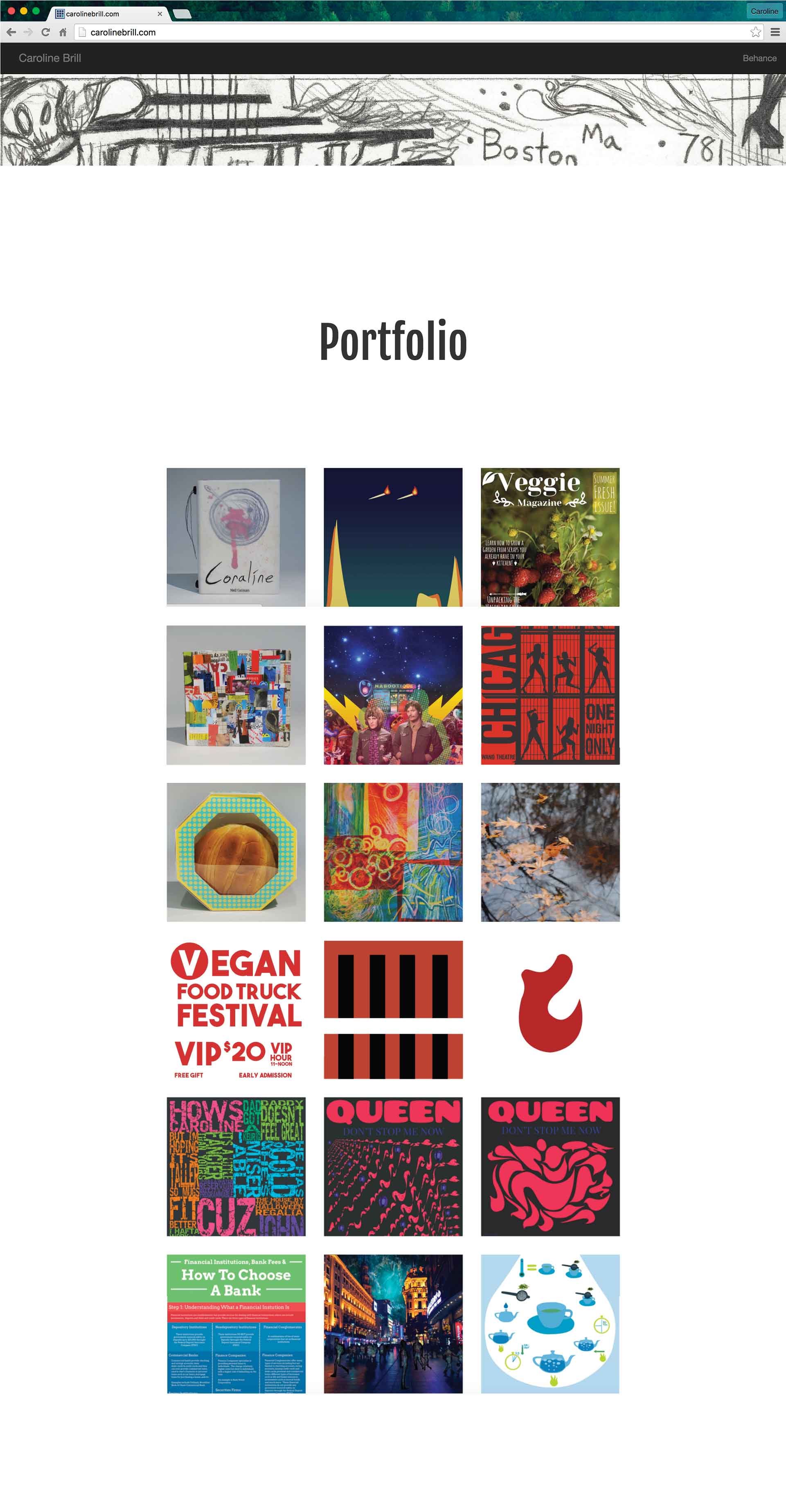
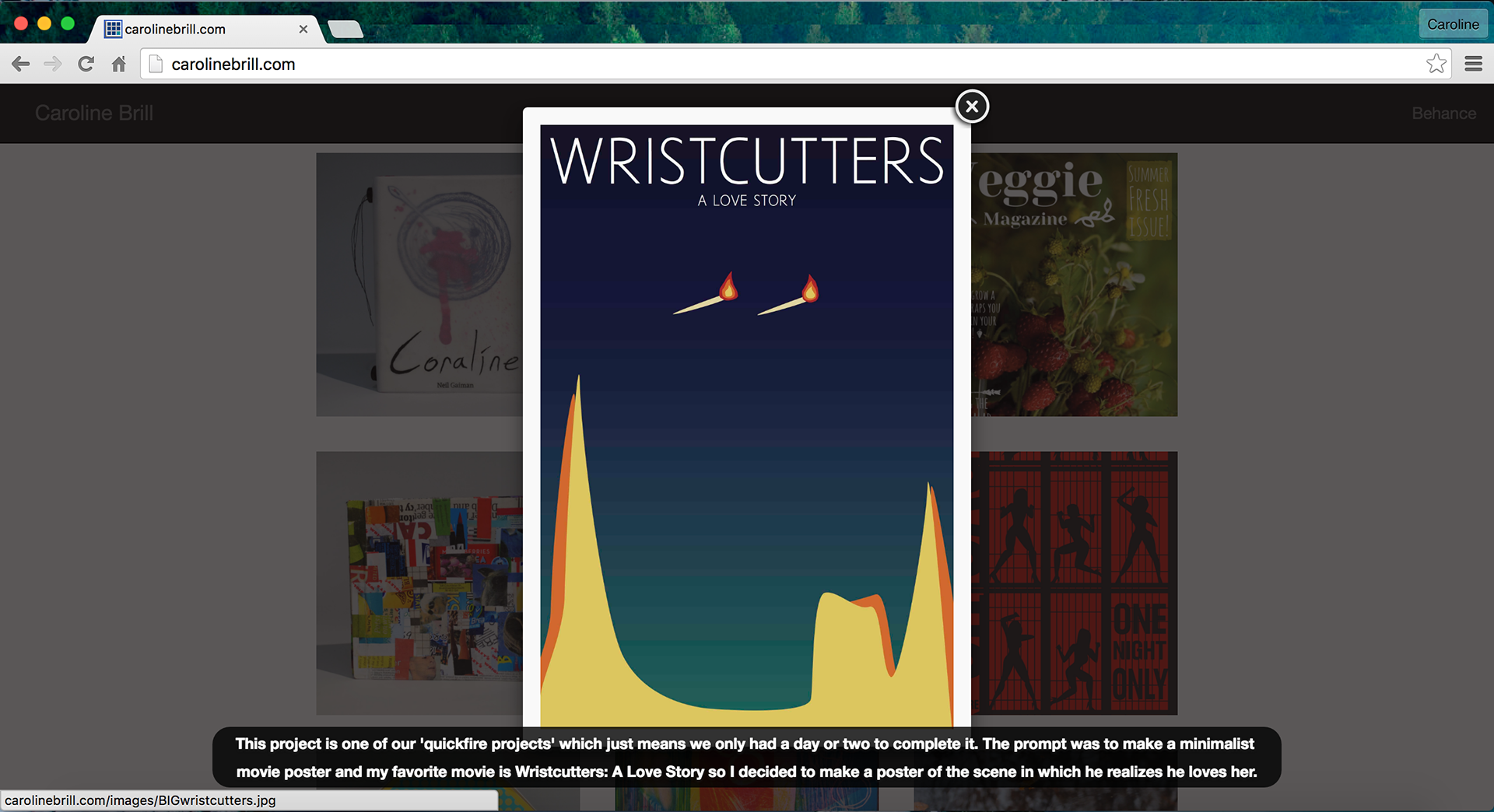
With my first website I hardcoded it myself using HTML, CSS, and bootstrap. I wanted my portfolio website to showcase my process but maintain a clean design aesthetic that wouldn’t conflict with my various projects. To do this I used uncomplicated fonts, hand-drawn icons, and black and white color pallet for the interface. I used a hand-drawn header that incorporated parallax scrolling to emphasize process and functionality. After clicking each project you could view a carousel of feature shots and sketches that lead up to the final project.

Caroline Brill Website About
Caroline Brill Website Portfolio
Caroline Brill Website Portfolio Feature
Caroline Brill Website Process Feature
Caroline Brill Website Resume and Footer
Next
Next

Print